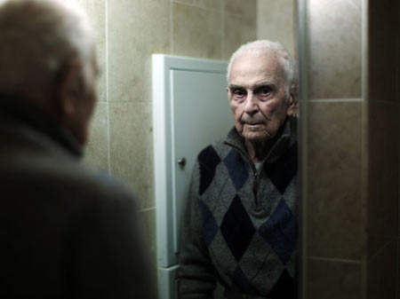
Phillip Toledano's "Days with my father" is the saddest series I've ever seen. His series is a journal of his relationship with the photographer and his father. Phillip's mother passed away and his father suffers from short term memory loss so at first Phillip constantly reminded his father of his mother's death but it became too much of a burden and eventually came up with an elaborate story about his mother's absence.
Sunday, November 21, 2010
Studio Journal #7
Thursday, November 18, 2010
Studio Journal #6
Amy Elkins concept of Family and the isolation that one feels when they have a type of "long distance relationship" with them. Her portraits of her family members are straight on and she combines landscapes with people something I've experimented on in the past and something I may dabble in the future. Each image is paired with text which I'm not a fan of. I believe that the images should speak for themselves.
She has a blog: http://amyelkins.blogspot.com/
I'm having problems uploading her photos so visit her website: http://amyelkins.com/home.html
She has a blog: http://amyelkins.blogspot.com/
I'm having problems uploading her photos so visit her website: http://amyelkins.com/home.html
Sunday, November 14, 2010
Studio Journal #5
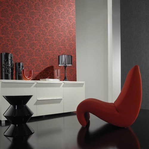
I'm slowly collecting more and more ideas and objects for my final thesis. As mentioned in the last post, I'm ending the decay series and picking up the family series I did before. I was planning on doing a mixed media piece, combining installation and photography. I finally found the wallpaper I want to use I hope I can have the same luck with buying it.
Studio Journal #4
William Eggleston. Now I know everyone has said something about his works but when I was a freshman I was shown this movie in Photo I and was impressed. His concept fascinated me. This movie help start the "Decay Series" that I had worked on from 2008-2010. I can officially say it's finished and I'm planning on relaunching my family series.
Below is the movie that started it all:
Watch more free documentaries
Below is the movie that started it all:
Watch more free documentaries
Wednesday, November 3, 2010
Studio Journal #3
I had to read the book "Photography as Contemporary Art" for one my other classes and I discovered artist Shizuka Yokomizo who has a stranger series. In this series, the photographer sent out letters to various strangers to see if they could stand in front of their windows at a specific time so Yokomizo can photograph them. There were more no's than yes' but those that had said yes had total control and decision over the posing and lighting. Here are some of the images.
Studio Journal #2
Here are a few and by few I mean two photos that I liked the most out of my last project. This is where I sorta realized I was bored with the urbanization decay in new brunswick.
Thursday, October 21, 2010
Studio Journal
I haven't been really inspired by much but I stumbled upon this artists' website: 9. http://www.mattstuart.com/. His work is fantastic I love the pairing of irony and people.
Recently, I took photographs at an abandoned water treatment faultily with a friend of mine to do a collaboration for an upcoming project. I'm excited to see the final result. (Pictures will be posted later!!) I had just wanted to put SOMETHING up here instead of nothing so I'm jotting down a few thoughts.
I'm almost getting a little bored with shooting abandoned places and I'm started to get back into portraits. Intermittent between the "abandoned series" I worked on last year I had taken pictures of my family. I think I want to go back to that. On Thanksgiving, I'm going to try and do that and I'm seeing some family Sunday so I might just go ahead and bring my camera along for the ride.
Sunday, September 19, 2010
Welcome Back Show
The Mason Gross “WLCMKCB” Show is a visual arts exhibition for second year graduate students with part-time and full time lecturers featuring two side special exhibitions. One of the two special exhibitions was Lyda Craig who was 1998 BFA graduate. The other exhibition had partnered with the Zimmerli Museum for their Water exhibition.
The Lyda Craig exhibition, specifically, caught my eye. Though I was a bit unimpressed by some pieces, “Tales from the Holoscene” definitely caught my eye. This piece had a Matisse feel with its bright, vibrant colors very gestural paint strokes. Craig’s pieces is almost reminiscent of Gaugin’s “Where do we come from? What are we? Where are we going?” The various planes and surrealistic like quality brought me into the piece and the gestural paintbrushes with the deep blues kept me interested.
Craig’s “Untitled (Thinker)” plays off of Rodin’s “The Thinker” but does it in a completely different way. The idealization in Rodin’s piece is meant to emphasize its contradictory statements (sports hero build vs. what an intelligential looks like) whereas Craig depicts a woman without any idealization (i.e. depicting a woman as she really looks). Though this piece is painted with gestural dark tones it is too close to life quality evokes a spooky, ghoulish tone.
Though, Kate Pollard is one of my professors I really enjoy her work. Her “Reynolds Girls” piece has such great range in tones and depicts such an intimate private moment that normally no one would be able to see. This almost invasion of privacy draws me so much closer into the piece and makes me wonder what exactly went on to cause this moment of sadness.
Eileen Behnke’s “..on the grass” painting has such a trippy feel to it. I really love the intensity of the colors and gestural quick flicks of the paintbrush creating a casual genre like painting.
Overall, I really liked the Welcome Back Show however the lack of theme really bothered me. The only restriction was that it was a small / medium piece but I felt like it could have more restrictions to make the overall show flow better. Though the show was curatored very well, the pieces seemed to clash and not flow as well. I know the difficulty in making a show flow well but I think it would have been received better if there was more of an overall theme.
Friday, September 17, 2010
Peer Interview
I had interviewed Graphic Design student Kelly Mcgovern on the third floor lounge at Mason Gross. Kelly has an interest in self identity and what are others react to that. She is open to any artistic door that comes her way and doesn’t want to be limited to anything. Though Kelly is caught in between the seriousness of the art world and the Japanese influence she had experienced in her early works. It was evident to me that she is working that out in her current works.
Me: What do you plan to do after you graduate?
KM: Essentially I got really into book design. I really enjoyed the projects we did and just being able to work with type in such a way that it can speak about the content and what you’re trying to say without image or without color just having text on the right kind of paper. That always fascinated me. For awhile junior year when I had to present my original thesis idea I was thinking about doing something heavily book-oriented but lately I’ve also been very into in web design and with the use of text, imagery and coding. So I think that speaks volumes.
Me: So you’ll be either more technically based i.e. with websites or book-based. You’re split in between the two right now?
KM: Yes, defiantly.
Me: In your work, you have more of commercial / consumer feel. What are you planning on doing for thesis?
KM: For thesis, my centeral idea is the construction of self and how I can go about answering how to construct a person’s self identity through design and I’m thinking of going the route of doing either book or web or doing a combination of both.
Me: I would recommend doing both because I feel with a book no one would appreciate it. If you would have the process of both you could have an interactive book and website and having the actual book there. That might be interesting.
KM: I really enjoy doing interactive stuff too. A lot of my projects, I’ve noticed over the past year or so have been heavily people oriented. We had to do a twitter poster project and I did mine on Yoko Ono with 20 of her twitter updates within the past 12 days I believe. I would have people play on her cut piece and they would cut up the twitter post that would eliminate the text to destroy the meaning but in itself creating more meaning.
Me: So its taking what she has and making it your own?
KM: Yes!
Me: Can we look more of your portfolio?
KM: it’s a bunch of stuff I’ve done here a few from high school. I’ve taken a silk screening class it was interesting it was graphic design but in more of an artistic messy hands on way.
Me; do you think it helped you more to get where you are now?
KM: I definitely think it did just going through that sort of process of layering things and what was important and what I needed to include and not include and time managing which was definitely important with graphic design.
Me: In this piece I can definitely get a graphic design element.
KM: yes its really nice and clean it was hard but worth it
Me: what are some of your favorite pieces?
KM: my favorite pieces I would have to say…
Me: or even ones that speak to you about the art
KM: I definitely like my web design right here is a website I did over the summer trying to focus on what my ideas for thesis would be in building up myself. I just used me as focus. I set up a formspring account and I had friends / family whoever I had on facebook all go on anonymously and talk about how they saw me and I wanted that to be without any memory or connection as why that person was lead to that opinion of me. What this website does it has several different people’s definitions of myself and than what I did was I highlighted a word that I picked out of several definitions and you hover over it and it drops down into the actual definition of that word and it shows how many times that word was used throughout this page. The website features several different instances of that.
Me: it would seem that your ability is more in website design than book design because I feel that it’s sort of a dying medium right now and website is what people are more directed towards
KM: that’s defiantly something to look at and something I had to contemplate over the summer because I really truly love the book medium I felt it was so intimate and time consuming and in a way web design is time consuming because you sit and fiddle around with the coding and it does speak to a larger generation because everything is on the web. You can even get books now on digital things like Kinde…
Me: I was going to say you can do an interactive book design maybe uses kindle and doing a book design as your thesis and have that out and have your own book. It’s combing and website design through kindle and you’d also have to create the book. So that’s an idea.
KM: I did this book over the summer. It was another interpretation of what I was trying to do and my teacher Jackie thinks that this has a ton of potential and what I did was make a cut out doll of myself and with every description came a new element that I would add. Right now this is just a few people doing the formspring I didn’t have much corporation from others. Jackie and I discussed this and we deicded if I could push this idea and I could really go all out and get really imaginative with certain things and take descriptions and twist it and make more, more it could be 100 pages or something.
Me: I think this is a really good idea for thesis because it is something original and there’s not many people doing this. It does combine the digital and book making if you can get more people to do it.
KM: this is essentially been a side project I did work on it in accordance with Jackie’s summer work but it’s not essentially part of the curriculum. It’s something I’ve been working on by myself; Jackie thinks I should pursue it.
Me: do you have another website?
KM: I have a website I did for web authoring in the fall semester of last year. I have the original homepage we did a book review I did Murakami about myself and projects I’ve done in graphic design classes.
Me: I think that this page isn’t as strong as your other page I feel like this is more playful and the other one is more serious. I don’t know what your final looked like but it does need some fine tuned.
KM: definitely more serious I find myself getting away from the playfulness because that was a lot of what I put into design originally that is something that Gerry commented on my final review because a lot of my stuff was really cutesy but I have evolved over the past few years.
Me: yeah I definitely think you’ve evolved a lot since freshman year. Im not saying get rid of the cutesy I’m saying just have an element of that within the seriousness because if it’s too serious it’s not as fun.
KM: Yes we have to balance it out. Its definitely still a part of me and I still do it but it’s not all that I focus on anymore. Its more range has broadened out a lot.
Me: what is a common theme between all of your work?
KM: that’s really hard for me to define.
Me: do you think that at this point it’s undefined because it is so broad like we discussed already?
KM: it really is very broad. I’ve done a lot of work just for corporate reasons for jobs I’ve done magazine layouts, I’ve done logos. In the beginning we touched upon the fact that my design was cutesy so I could say that was a running theme in the beginning. Now it’s broadened, I’ve just been really thinking of different ideas.
Me: so you’re unsure what your theme is, it’s a bit confused right now? It’s okay though, you still have time to grow. What are some of your influences? I know from just knowing you that there’s a Japanese influence. Just looking at your later work, it doesn’t seem that much evident.
KM: Not so much anymore and it’s funny because it’s something I did want my final thesis to touch upon the fact that I do like that but over the summer after heavy contemplation it just gave way to something so much more. Your interests are only a fraction of who you are and who you are is definitely a broader bigger picture and I think that something is I want to be able to show. It’s going to be a piece of what my thesis is going to be. It’s going to just so much than what I’m going to be showing there.
Me: I think that if you showed your interest in the Japanese world I don’t think it would be taken as seriously.
KM: definitely not.
Me: I feel that people would look at it and say “oh this looks nice” and would walk right past it and not appreciate it. Maybe, I’m not sure I’m just throwing ideas out there; maybe something interactive would be key. For your thesis go completely away from it, maybe do a video game design with even small Japanese influence but you’re interacting with it, so it’s a lot more than just that. It’s a lot more serious. Your side project and your formspring idea it’s nothing that you’ve done before.
KM: Yeah. I’m just really inspired by the whole thesis process.
Me: the connection between your work and the Japanese influence is pretty obvious, especially in your early work in concerns with your collages are more obvious than your later work. In your later work there is a tinge of Japanese influence i.e. with the imagery it’s not overall which is good because it shows your growth and development. In typography it’s hard to show a Japanese influence.
KM: yes definitely. If you had the symbols or something meant to mimic the symbols would probably be something frowned upon in the world of typography.
Me: no it probably wouldn’t go over well. So material wise would you be interested in doing website design or book making? If someone had come up to you and asked you if you wanted to do t-shirt design for the rest of your life would you be okay with that? Or would you try and continue with internet and book design on the side?
KM: I would like to do it all. I really just enjoy all of it. I found poster making the most intimating. And that was just because you feel essentially the poster is fleeting and you have to say a lot with just one big image. So I think that is something I’d consider doing if I had to.
Me: I feel like with posters it’s more cliché and I would say t-shirt design, not to say that’s where the money is at, but it would seem that it was a better choice or even web design but I’m not sure If you’d have to go to graduate school. And that’s my next question, are you planning on going to graduate school?
KM: not currently. I’ve been looking around a couple of places but I’m looking forward to just taking a break and possibly traveling around.
Me: where would you want to travel to? After graduation, what are your plans? If we graduated tomorrow and after that, you know week of sleep, what would you do?
KM: I definitely would love to travel to Japan.
Me: Do you think that traveling to Japan it would bring back the cutesy influence again which would ruin the seriousness of your work?
KM: That is a problem or could be potentially a problem, I’m hoping I could carry all that I’ve learned with me and going in there and not just looking at the cutesy but going back centuries you look at their woodblock prints which is so elegant.
Me: would you be interested in doing woodblock printing?
KM: possibly. I was able to do that a couple times. That did, though, run over the liens of cutesy because my designs have just been that way but going at it in a more serious elegant approach.
Me: I think your work, like this piece, it isn’t cutesy at all. If this was a woodblock print it would look better because it would capture the texture of the piece. This is not cutesy at all it’s a lot more serious than the collages where it wasn’t really meant to be taken seriously. Are there any writers or movies that influenced you?
KM: as of late, in commenting on Japanese influence and trying to make it my own and finding myself in it and not just saying this is strictly a Japanese chibi influence, I’d have to say Brian Lee O'malley ‘s Scott Pilgrim comics really influenced me. Also reading interviews with him about his love for manga when he was young and he just took it and made it his own. That is huge and speaks to a lot of different audiences and not just those who like manga but normal comic lovers and gamers. It spoke to a wider audience. He said, “Yes I like this but I’m going to do it myself and I’m going to do what I want.” I think that it definitely influential.
Me: would you be interested in making your own manga? It would be combining a few things. Would you want to be taken seriously as an artist?
KM: I do want to be taken seriously.
Me: I think you need to find a balance. You started to find a balance but it’s still in the process of. We’ve already talked about thesis and you said you wanted to do…?
KM: self identity.
Me: Self identity. Would you be interested in doing the formspring idea for thesis?
KM: Definitely.
Me: how would you do that? Would you make a website and a book?
KM: definitely yes. In having the influences of both and having something tangeable you could have, something you could hold and flip through it and you can keep it with you at all times. Although now the internet has grown to the point where you do have the internet on your phone you have that with you at all times when the network is available. It’s also something that is more interactive in a way. You can probably do more with the internet than realistically than a book unless you go into a 3D pop-out book.
Me: That would actually be cool if you did a 3D book but maybe not have it together as book but have the sheets laid out and framed so you can have people can see. I know that when I go to galleries and I see a book I’d flip through one page and than they’d go on. So I would consider something that is more in your face. I don’t think there’s anything I missed…
KM: I think we covered everything.
Sunday, September 12, 2010
Water Exhibition
The Water Exhibition at the Zimmerli museum encompasses the theme of water to take it out of its typical category / context. In concerns with this show, the museum curator used pieces from its own collection from the American 20th c prints, 20th c Soviet Union Non-Conformist Art and 19th century European paintings (mainly French). Some aspects of the show are strong whereas others I felt were struggling.
The curator had taken some European paintings and placed them in the show just because they had scenes of water landscape which I felt weakened the show.
One piece in particular I felt the message was being pushed was the Maya Lin nail installation, I did enjoy the play on light and shadow and the time that was spent on it but the river message was pushed.
A great contrast to this is the second Maya Lin piece with the glass orbs, I thought this was a great contrast and resembled rain drops.
The Hans Haacke condensation cube had the PERFECT correlation and placement with the Maya Lin orb piece. The condensation on the top of the cube looked exactly like the glass orbs.
Another strong piece was the Iceberg bottle piece at the entrance of the show. It had caught the attention of everyone because of its play on 3D.
The last piece that I was able to relate to was the Atul Bhalla Urban Spaces photography piece; this photographer took photos of various places where water was accessed for the public. Though this is done under the theme of decay which is one I relate to in my own work. So, in seeing this at the show I was very pleased.
Overall I think that this show was done very well but as I’ve said before I thought some pieces were struggling to fit into the show (i.e. the Maya Lin Nail Piece) but the correlation and the placement of Hans Haacke’s and Maya Lin’s glass orb piece was absolutely brilliant and made up for the show’s few flaws. If I was the curator I wouldn't change anything but I would exclude the Maya Lin nail piece and some European water landscape paintings but everything else I would leave the same.
Subscribe to:
Posts (Atom)